7 Best Shadcn UI Hero Sections for SaaS Websites
A SaaS hero has about three seconds to do four jobs: name the product, name the outcome, prove it's real, and point to the next step. Most fail at job two.
These seven Tailark blocks don't. They come from Pro/Quartz, Dusk, and Veil, and each one ships as a complete pattern: typography scale, illustration or product visual, CTA pair, dark mode, responsive variants, and shadcn/ui theme variables. Start with the first block if you need a polished general SaaS launch page. Move down the list if your product has a sharper category: consumer mobile, AI tools, video-led storytelling, infrastructure, payments, or analytics.
What every block on this list does
- An
h1that names the product and the outcome, not a tagline - A primary CTA pointed at a real destination, plus a low-friction secondary
- A purpose-built visual — product UI, illustration, or motion — instead of stock art
- Optimized assets with no layout shift and accessible markup at first paint
- Composition that holds from 360px to 2560px wide
- Dark mode wired throughout, no second illustration to maintain
A note on the screenshots: the demo content — customer names, dollar figures, brand logos, chat prompts, example copy — is meant to be replaced. Look at the structure, not the placeholder values.
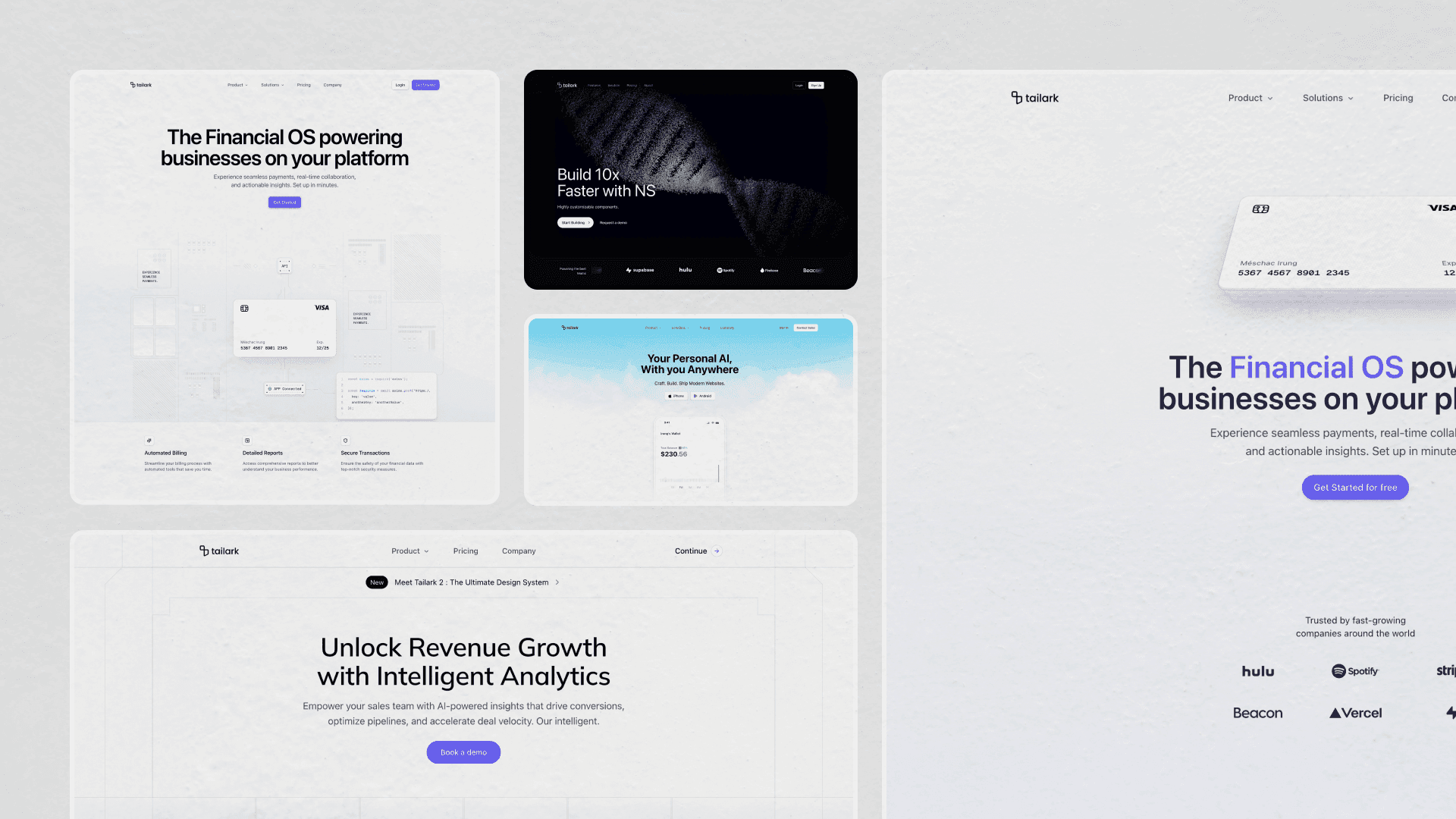
1. Tailark Dusk Hero Section One
Start here if you're not sure where to start. Hero Section One from the Dusk kit is the generalist: announcement pill, large headline, short subhead, two CTAs, and a product screenshot below. The difference is the polish around the standard pattern. The text enters with blur, the desktop view gets a cinematic lighting layer, and the logo cloud turns into a click target on hover.
What makes it work
The H1 uses TextEffect from @motion-primitives/text-effect with preset="fade-in-blur", so each word resolves into place instead of appearing as one block. The subhead follows line-by-line after a short delay, and the CTA cluster lands after the copy. It gives the hero a staged entrance without turning the first screen into a loading sequence.
Cinematic stage lighting on desktop
The desktop layout adds three rotated radial gradients behind the content, all wrapped in hidden lg:block so smaller screens skip the effect. In dark mode, a masked night background fades in underneath. The app screenshot uses two real PNG files — one for dark, one for light — swapped through hidden dark:block / dark:hidden, which gives each theme a screenshot designed for it instead of relying on filter math.
Two smaller interactions carry the same level of care. The logo grid blurs on hover while a centered customer link fades in. The header also changes after scroll: it shrinks, gains blur and border, hides Login / Sign Up, and reveals a single Get Started button. The page keeps simplifying as the visitor moves down.
When to pick it
If you don't have a specialized story to tell, Hero Section One is the default. It is the closest thing to a polished SaaS launch landing in this list.
Swap the announcement pill first, then the screenshot, then the logo grid. The motion and lighting already carry the page; your job is to make the first sentence and the product image specific.
Install it with the shadcn CLI:
pnpm dlx shadcn@latest add @tailark/hero-section-1
2. Tailark Pro's Hero Section Two
Hero Section Two stages a single product against a real-photo sky. The CTAs are App Store and Google Play. The visual under the headline is a hand-coded phone UI, with a small award mark underneath. Every part of the layout assumes you're shipping a consumer mobile app, not selling an API.
A parallax sky, not a static gradient
The cloud background isn't a CSS gradient or a static image. It is a photograph driven by Motion: useScroll reads the page's scroll position, and useTransform(scrollY, [0, 500], [0, -200]) maps the first 500px of scroll to a 200px upward drift. The sky moves slower than the page, so the phone feels like it is sitting in front of a deeper scene.
The image is also wrapped in mask-radial-from-55%, which fades it into the page background at the edges. No overlay gradient, no box-shadow, no hard cut against the next section — one mask line does the entire transition.
Two skies, one for each theme
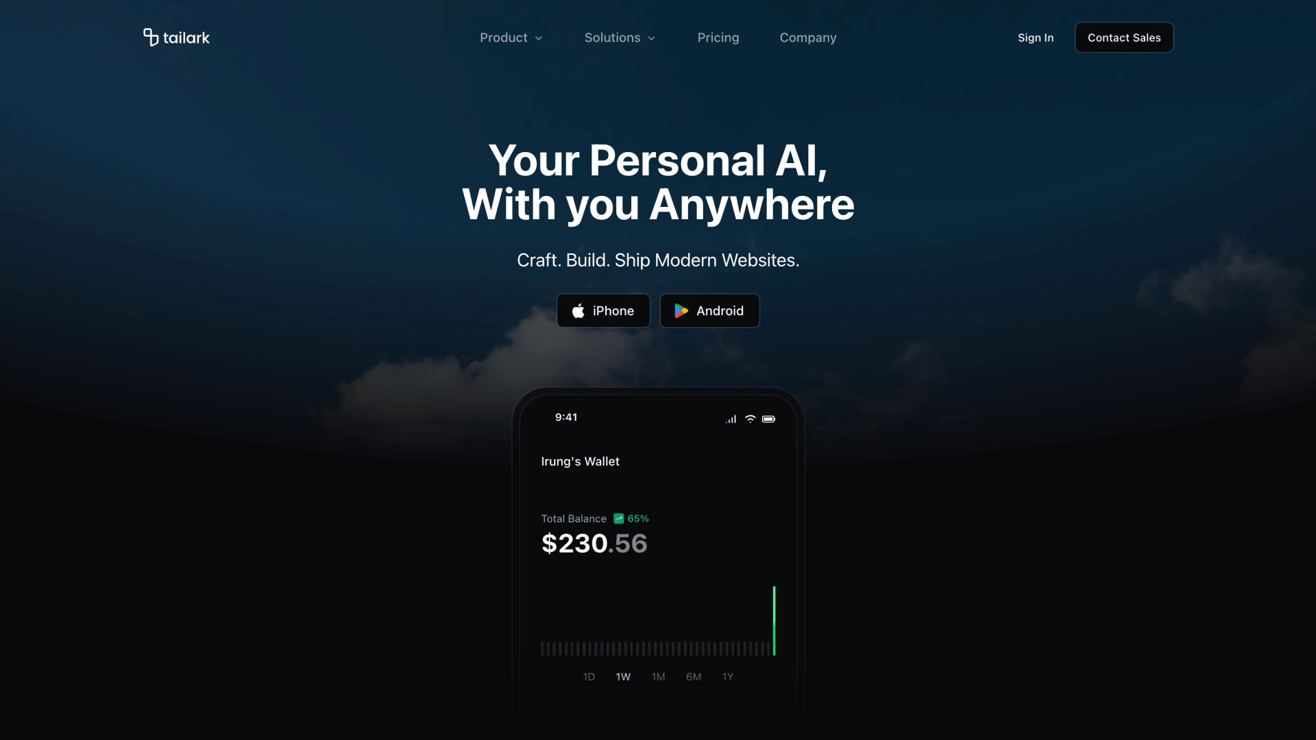
The block uses two sky images: one for light mode, one for dark. A dark:hidden / not-dark:hidden pair swaps them, so visitors only download the version they need.
The hand-coded wallet
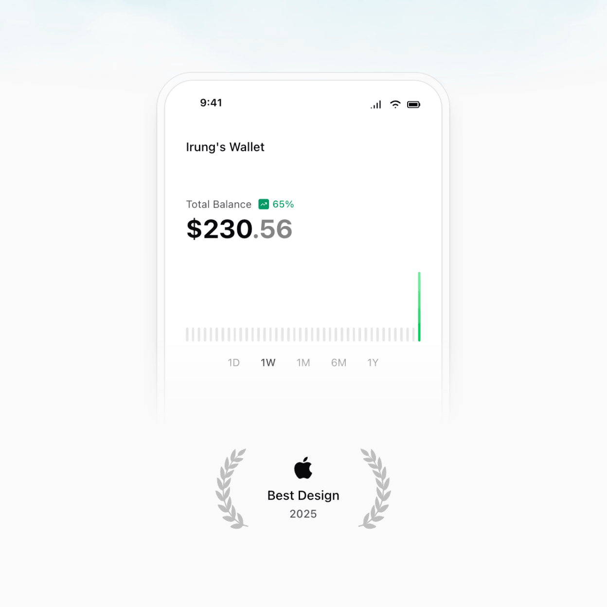
The phone is hand-coded, not exported. The bezel is a rounded-t-[2.5rem] container with a bg-background/75 glass surface, the inner screen uses bg-card, and the bottom dissolves into the page through mask-b-from-75%. Inside, the default wallet screen has a status bar, app header, balance row, sparkline, and timeframe pills. Every element lives in mobile-wallet.tsx, so you can keep the device shell and replace the screen with a chat thread, step counter, onboarding flow, or any other mobile UI.
A header that shrinks as you scroll
The navigation starts as a transparent floating bar. When scrollY crosses 50px, a data-scrolled attribute shrinks the container, adds a ring, applies bg-background/75, and turns on backdrop-blur. The desktop menu uses NavigationMenu; mobile renders the same data as an Accordion inside a full-screen overlay.
When to pick it
If you're launching a consumer app — a wallet, a fitness tracker, a meditation product, a personal AI — Hero Section Two is the closest thing on the list to a working App Store landing page.
Start customization inside the phone. Keep the shell, sky, and store-button layout, then replace the wallet screen with the one mobile moment that sells your app fastest: a saved workout, a generated plan, a completed transfer, a finished meditation, or the first useful AI response.
3. Tailark Veil Hero Section Three
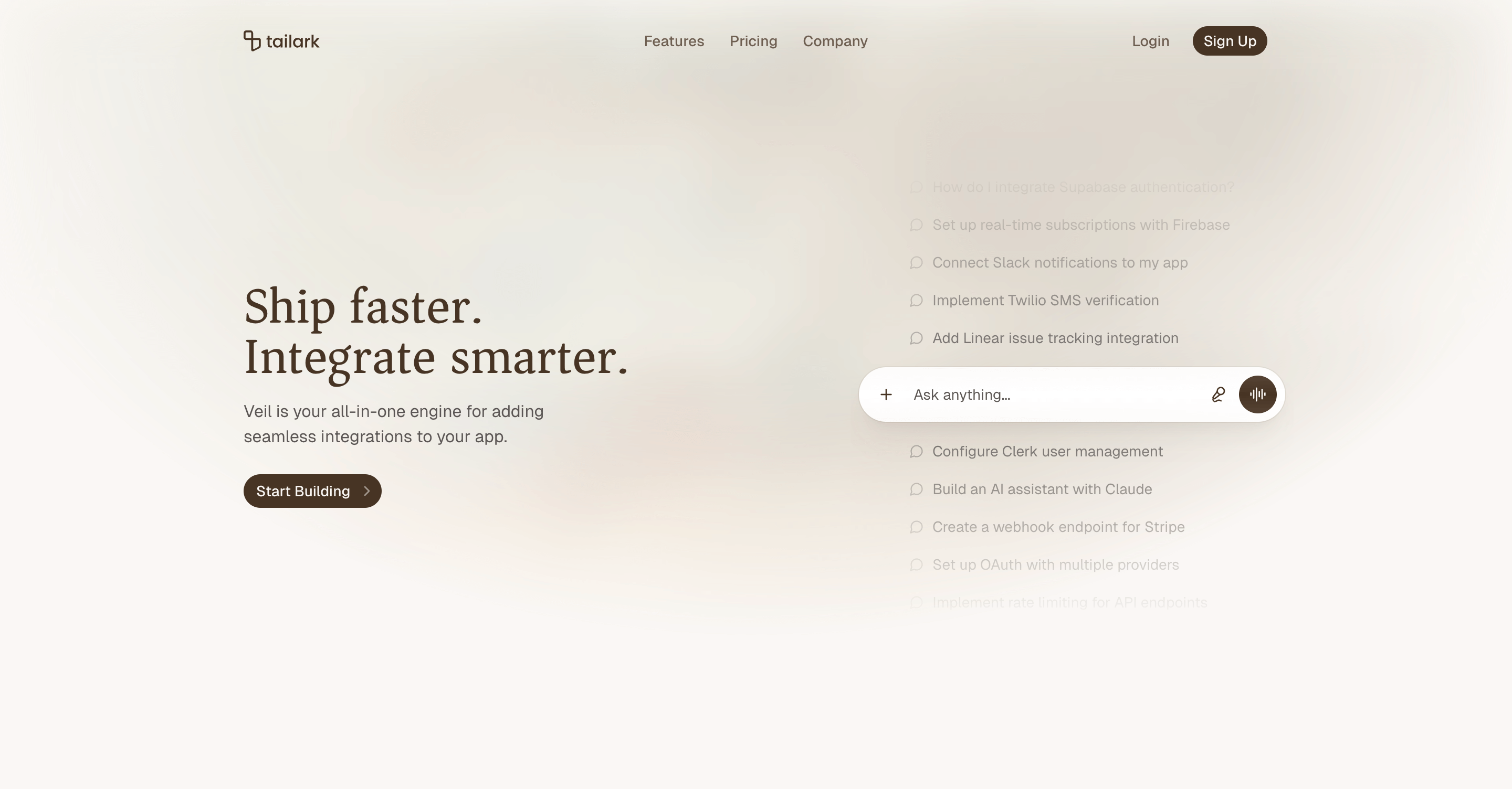
The pitch for this one is "we are the integration layer for your AI assistant." Instead of a product screenshot, the right column is a vertical scroll of example prompts above an Ask anything... chat input pill. The left column carries a serif headline and a single primary CTA. The illustration is the product.
A vertical scroll of prompts as the illustration
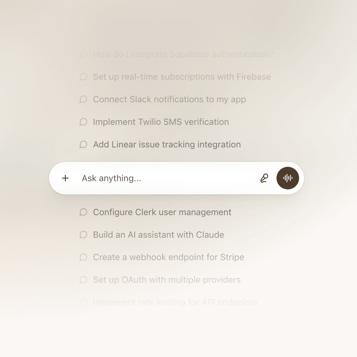
The list is a hardcoded array of strings in index.tsx, each rendered as a row with a small MessageCircle icon. Pick prompts your customers would actually type; the lineup is the entire pitch for what your product does. mask-y-from-50% fades the top and bottom edges, and the anchored input pill below the list makes the whole right column read like an active chat surface. Swap the strings, change the icon, or replace the pill with your real input UI.
A serif headline and a softer canvas
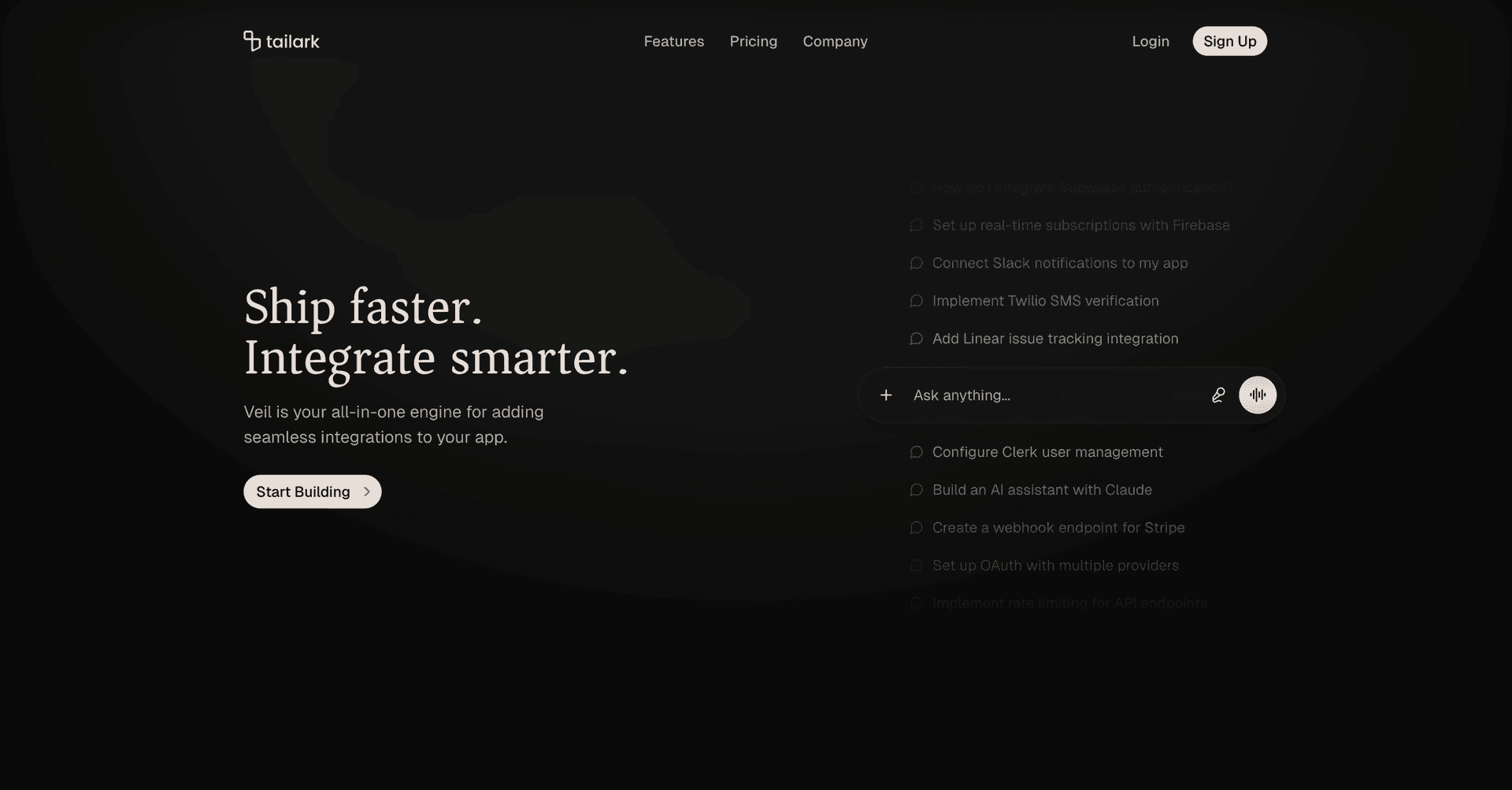
The H1 uses font-serif font-medium, which shifts the tone away from the sans-serif default. Behind it, a blurred photo becomes color and texture rather than a literal image: blur-xl, opacity-75, and a radial mask keep the bright spot above the headline. In dark mode the same image drops to opacity-5, so the prompts and pill keep their contrast.
A nav that consolidates on scroll
The header has one sharp behavior: once scrollY crosses 50px, it gains bg-background/75 backdrop-blur-lg border-b, hides Login / Sign Up, and reveals one Get Started button. Above the fold, the visitor is browsing. Below the fold, the nav asks for the one action that matters.
When to pick it
If you're building a developer tool, an AI assistant, an integration platform, an API product — anything where "show what people ask of it" beats "show the dashboard" — Hero Section Three is the closest thing on the list to that pattern in shippable code.
The first edit is the prompt list. Write the exact requests your buyer would type when they understand the value of your product. If the prompts are right, the rest of the hero does not need much explaining.
Install it with the shadcn CLI:
pnpm dlx shadcn@latest add @tailark/veil-hero-section-3
4. Tailark Dusk Hero Section Five
Hero Section Five sells intrigue. The whole upper panel is taken over by a looping video. The demo ships with a particle DNA helix rotating against a deep navy field, but it is still just one <video src=...> line. Drop your own clip in and the rest of the layout doesn't budge. The headline anchors at the bottom-left, and a logo marquee runs underneath.
One video, both color modes
The video is a single MP4, but it serves both themes. The trick is not-dark:invert: dark mode plays the clip as recorded, while light mode applies filter: invert(1) in the browser. No second encode, no second asset, no theme branch in the JSX. The surrounding frame uses rounded-3xl lg:rounded-[3rem] and inset-1, so the video reads as a deliberate panel instead of wallpaper.
A layout that pivots at the breakpoint
Mobile and desktop don't share a layout — they share a codebase. On phones, the hero is aspect-2/3, a tall portrait crop that keeps the headline above the fold. At lg and up, it flips to aspect-video, a cinematic widescreen panel. Same JSX, different proportions.
A real logo cloud, not a static row
Below the video, example brand marks cycle through InfiniteSlider from @motion-primitives/infinite-slider. The key detail is speedOnHover={20}: the ticker slows when someone points at it, so the row feels interactive instead of decorative. Gradient edge fades plus ProgressiveBlur make the marks dissolve into the page rather than clip at the sides.
A lighter scroll-aware header
The header is intentionally lighter. When scrollYProgress crosses 0.05, the container gets bg-background/50 backdrop-blur-2xl, and the vertical padding tightens from lg:py-6 to lg:py-4. If you want a nav that gets out of the way and stays there, this is the quieter option.
When to pick it
If your product needs to project sophistication without explaining it — biotech, ML/AI platforms, research tools, dev infrastructure — Hero Section Five gives you the right surface. Pick a clip that visualizes what your product orbits around. The layout handles the rest.
This block lives or dies on the video. Use a clip with one clear visual idea and enough negative space for the headline. Avoid busy screen recordings; the panel works best when the motion feels like a world behind the product, not a competing demo.
Install it with the shadcn CLI:
pnpm dlx shadcn@latest add @tailark/hero-section-5
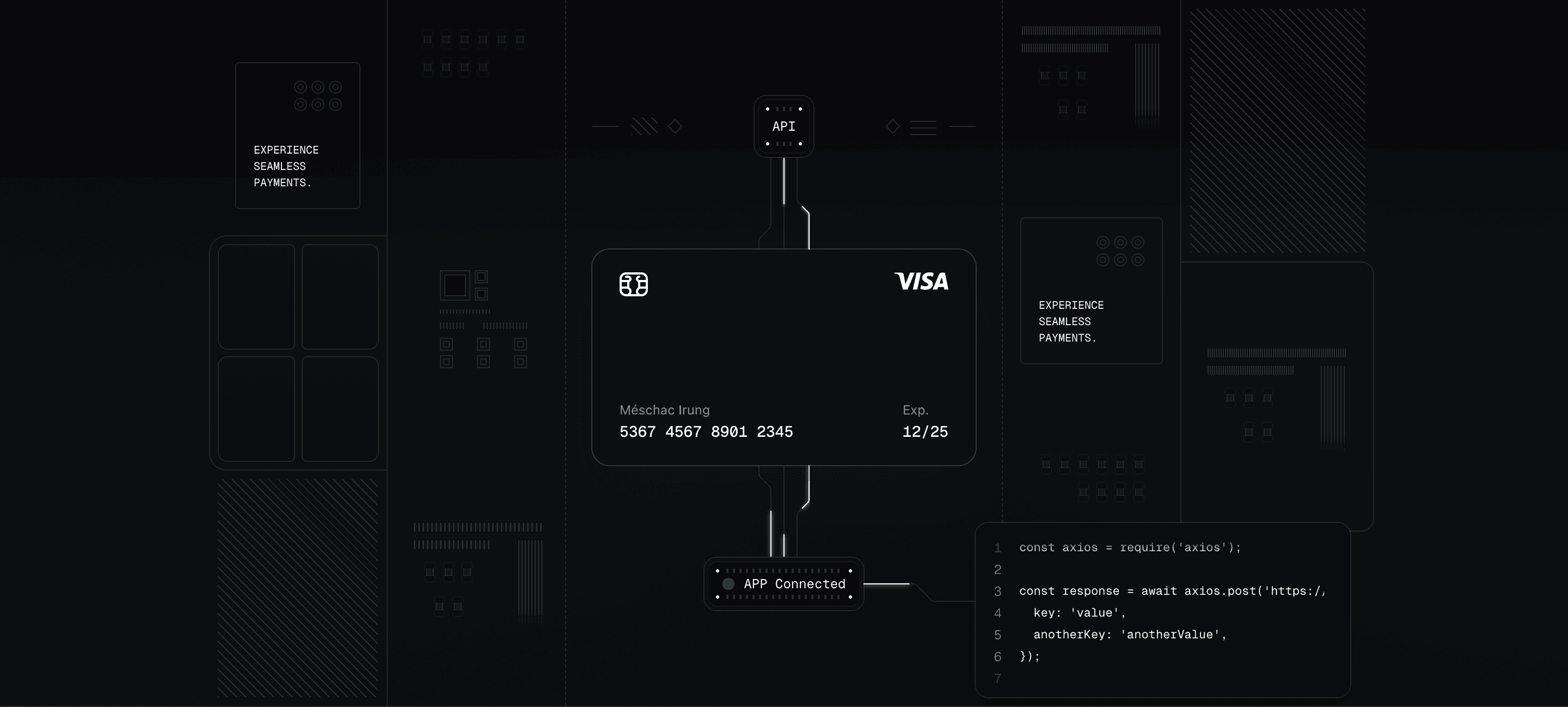
5. Tailark Pro's Hero Section Sixteen
Hero Section Sixteen is built for fintech, payments, and B2B infrastructure products. Top of the section: a centered nav, a headline, and a single CTA with a quiet indigo accent. Below the fold, the block turns into a three-column system diagram: payment widgets on the sides, an API-to-card-to-confirmation flow down the middle, and a code block tucked into the bottom-right.
Why the illustration is the hero
Most SaaS heroes lean on a flat product screenshot. Sixteen builds a system diagram instead. The center column traces a path you can read in one glance: API → card → confirmation → code. Animated beams run through that path on staggered loops, so the illustration communicates "data is moving through this product" without playing a video or showing a full dashboard.
Hand-coded, not exported
The layout is mostly div elements with Tailwind classes — no dashboard mockup PNG, no Figma round-trip. SVG only appears where it has to: the animated beam paths, the card logo, and the chip. Everything else is a real React element with props and theme tokens. Edit a label, change the card placeholder, drop a node, or restyle a connector the same way you'd edit any other component.
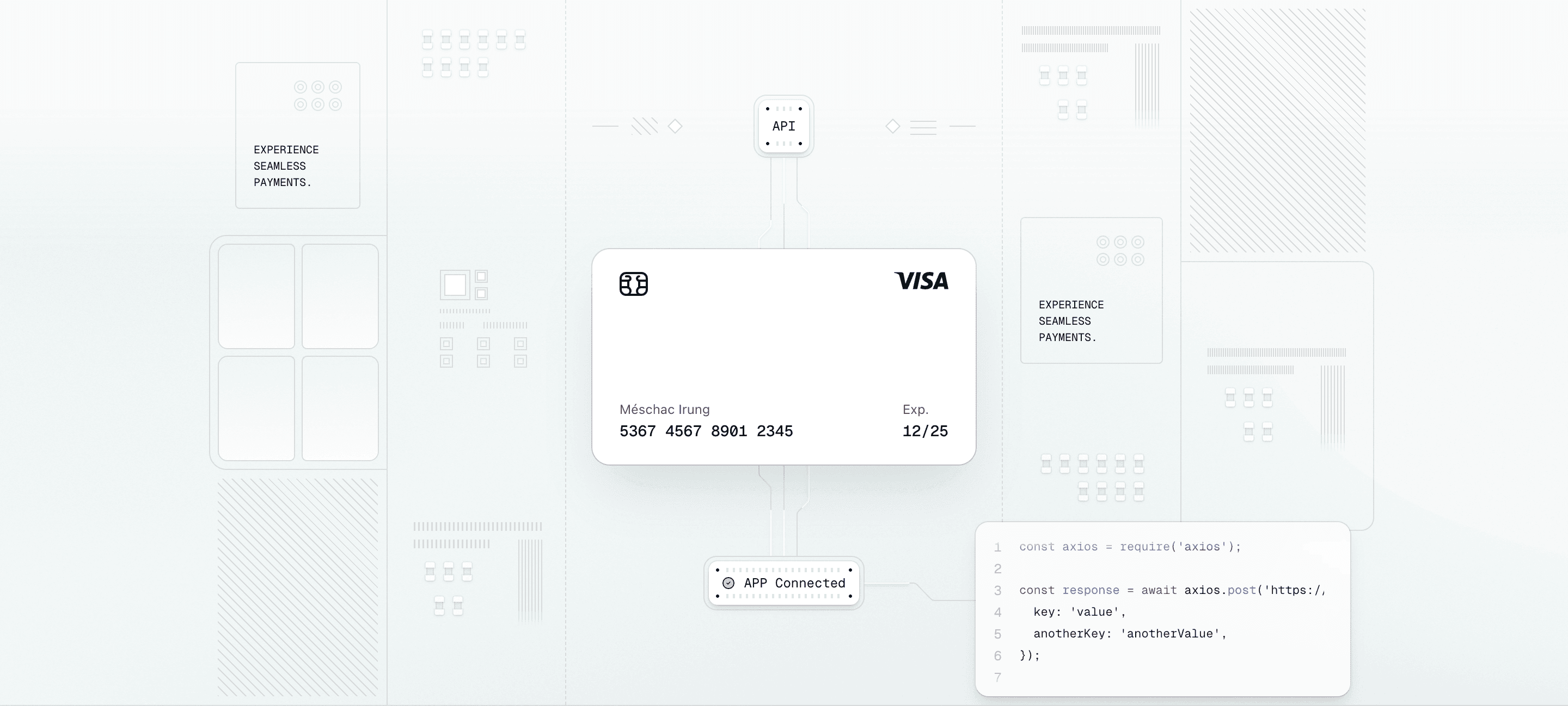
What you can swap
Replace the demo card content, retime the beams, recolor the shadows, swap the confirmation widget, or replace the embedded code block with one of your real API calls. All of it lives in image-illustration.tsx next to your other components, not in a vendor editor.
Light and dark, no extra work
Every gradient, border, and shadow pulls from your shadcn/ui theme variables. The illustration derives its decoration palette from [--color-border-illustration:--alpha(var(--color-foreground)/12.5%)], so connectors, surfaces, grids, and annotations retune together when the theme changes.
Built for every viewport
Desktop renders the hand-coded illustration inside a max-w-6xl container. Below lg, a static aspect-72/41 image takes over and the heavier desktop background is not requested. Two device classes, two render paths, no extra payload where it doesn't help.
If your product touches a system rather than a single screen, Hero Section Sixteen is the one to start with.
Replace the center flow before anything else. The block works when the viewer can read your system path in one glance: input, transformation, output. The side widgets are support; the middle column is the pitch.
6. Tailark Pro's Hero Section Fifteen
Hero Section Fifteen is the most motion-forward block on the list. The illustration is a stack of three credit cards built as plain div elements, and the stack is wired to scroll position. Drift, scale, and tilt all react to the page in real time. The headline arrives staggered above it, and the demo copy frames the product as payments infrastructure, not consumer fintech.
A card stack that animates as you scroll
Three transforms run on a single motion.div: y drifts the card stack down, scale grows it from 1 to 1.2, and rotateX lifts the stack from 16° toward 8°. The parent container uses perspective-near, so the tilt reads as a real 3D move instead of a flat skew. Three card layers create the depth before the motion even starts, and the front card uses a masked diagonal grid texture for detail.
A headline that arrives in pieces
The H1, subhead, and CTA are wrapped in an AnimatedGroup: blur, slight upward offset, spring to rest, staggered by 0.25s. Inside the H1, one phrase uses bg-linear-to-b from-purple-400 to-indigo-500 bg-clip-text text-transparent. Pick the product name or outcome in your own headline and give that phrase the gradient treatment.
A section that owns its color
Most blocks on the list stay neutral and lean on your shadcn/ui theme variables. Section Fifteen scopes its own foreground color at the section root:
className="bg-background relative [--color-foreground:var(--color..."
That one line overrides --color-foreground for everything inside the section. Light mode tunes the text, borders, and rings to deep indigo; dark mode flips them to white. Change the indigo-* values to another Tailwind color family and the whole section changes accent without touching every child.
When to pick it
If you're building a payments platform, billing engine, or embedded-fintech product, Section Fifteen gives you the scoped palette, 3D scroll motion, and staggered headline entrance ready to slot in.
Customize the headline and color family together. The gradient phrase should name the value customers remember, and the section color should reinforce that value without retheming the whole page.
7. Tailark Pro's Hero Section Six
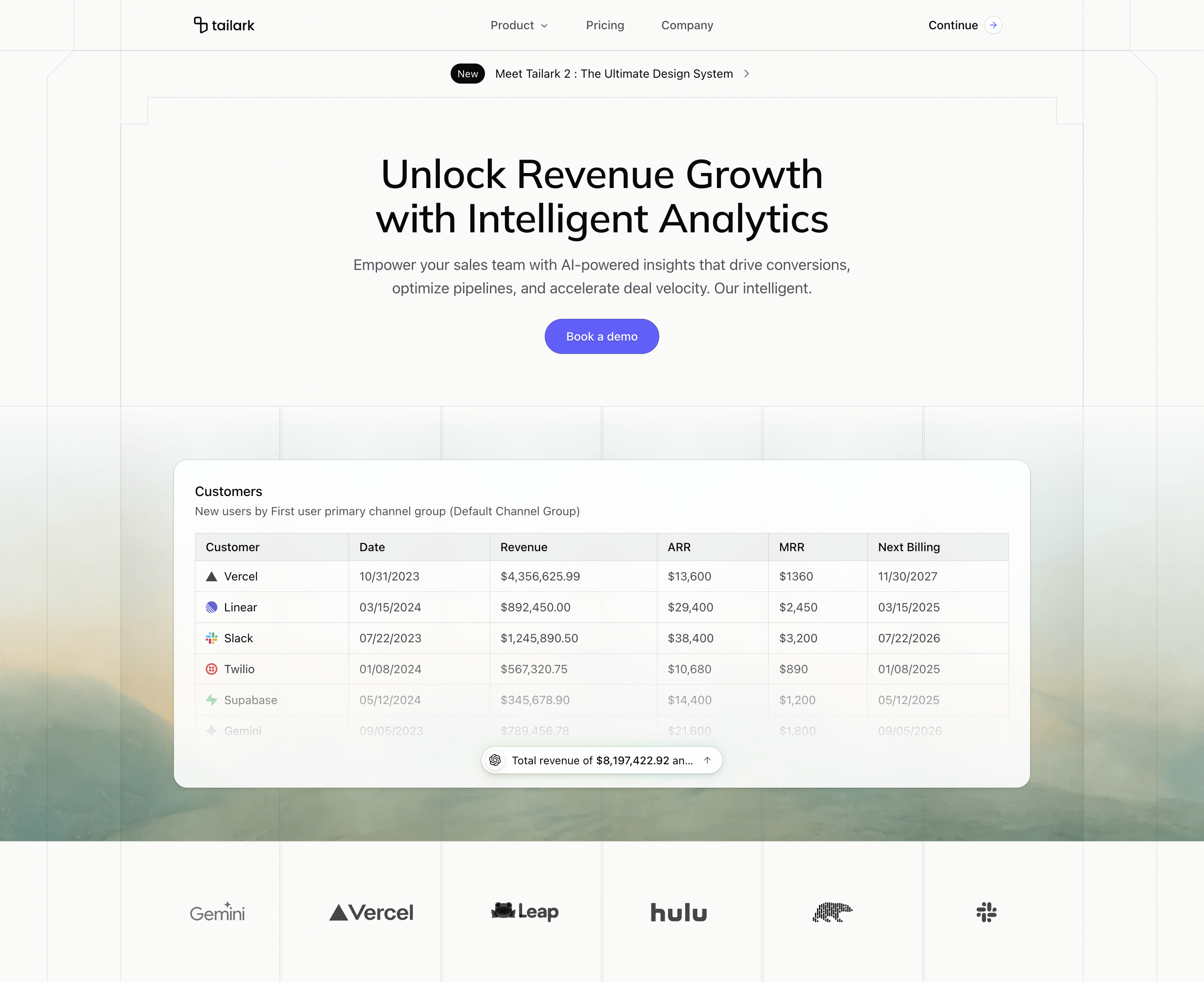
Hero Section Six is the dashboard hero. Above the fold: an announcement pill framed by a beveled architectural border, then a serif headline, subhead, and single CTA. Below the fold: a recessed panel with a customer table and an AI insight pill that computes totals on the fly. The whole block reads as "this is what the product looks like in production."
A real table with an AI synthesis on top
The table isn't a screenshot. It's a real HTML <table> rendered from a hardcoded array in product-illustration.tsx. The demo rows are placeholders; replace the array with your real customer book and the table redraws. A mask-b-from-55% fades the table at the bottom so it doesn't end on a hard row.
The AI insight pill is anchored over the table at bottom-center. It has an AI logo on the left, a one-line summary in the middle, and an ArrowUp on the right. The summary is computed from the same customer array, so edits to the table change the output. Behind the pill, a blurred emerald-to-purple halo gives it the "this is the AI" glow without needing another illustration.
A logo cloud that cycles by category
Most blocks ship a static row or a marquee. Section Six ships a grid that rotates by category: six cells, each pinned to a pool of three example logos. Every 2 seconds, one cell flips to the next logo in its pool through AnimatePresence with mode="popLayout". The row stays alive without becoming a ticker, and you can replace each pool with your own integrations, partners, or supported services.
An architectural frame around the announcement
The whole section sits inside a hand-drawn border architecture. Absolutely positioned <div>s draw the page column, the headline frame, and the announcement strip behind the content. The corner-bevel utility repeats in the logo grid cells below, so the dashboard band and the top announcement feel like one system. Behind the band, a masked photo and faint overlay grids add the blueprint texture.
When to pick it
If your product sells the judgment layer rather than the data layer — revenue intelligence, sales forecasting, AI-powered analytics — Hero Section Six is the closest thing to a working analytics landing in shippable code.
Replace the table schema with the artifact your buyer already trusts: pipeline, usage, spend, incidents, invoices, forecasts. Then make the AI pill summarize the one number or risk they would normally have to calculate by hand.
How to pick
If you're still deciding, use this map:
- General SaaS landing, no specific category in mind: Hero Section One (Dusk)
- Consumer mobile app launching on iOS and Android: Hero Section Two (Pro)
- AI assistant, developer tool, or integration product: Hero Section Three (Veil)
- Atmospheric pitch — biotech, ML platforms, research tools: Hero Section Five (Dusk)
- B2B infrastructure where the product touches a system: Hero Section Sixteen (Pro)
- Payments platform or billing engine: Hero Section Fifteen (Pro)
- Analytics or business-intelligence dashboard: Hero Section Six (Pro)
If two blocks feel close, choose by the first visual you want people to remember. A product screenshot says "this is usable today." A phone mockup says "download this." A prompt list says "ask the system." A video panel says "there is depth here." A system diagram says "we connect the pieces." A card stack says "we handle money." A table with an AI layer says "we turn messy data into a decision." The copy can change later. The first visual decides what kind of product the visitor thinks they are looking at.
The through-line is the same: you edit .tsx files, not Figma exports; the demo content is scaffolding; dark mode is already wired; and the blocks don't depend on each other. Pick the one that fits your category, install it with the command in that section, and start replacing the placeholders with your own product story.
Build with Tailark Pro
Tailark Pro brings together essential marketing pages, blocks, and illustrations — designed to help you launch faster without compromising design.
Get AccessLearn More